Project Corrections / Time spent: I recreated the images project as well as the event ad project. I wasn’t too pleased with how the originals turned out. I used suggestions that Brother Stucki made in his comments to better my project. Spending an hour on each project, I applied the design principles to enhance the final project. I also went back and made some minor adjustments to my flier. I had to change the text size and create more white space. That took 15 minutes. For another 15 minutes, I worked on correctly formatting my letterhead. It wasn’t in the correct format so it wasn’t properly imported into my portfolio. I spent a total of 2 hours and 30 minutes on corrections.
Message: I want the audience to know that I spent a lot of time on the work done this semester. I know that I am not perfect, and still have a lot to learn, but I have come a long way. I want this portfolio to show that I worked hard on each project.
Audience: The intended audience is for my classmates of Comm 130. I want to share with them what I have worked on all semester.
Top Thing Learned: There is more to designing than just putting colors together and editing pictures. There are specific principles that should be applied in order to enhance your project. I had never even heard of typography rules until this class, but it makes sense! I had also never worked with any Adobe programs, so I learned the basics of those programs. I learned that critiques are helpful, and even though it can be hard to have someone critique your work, the more help you get, the better it will be.
Future application of Visual Media: I work in a dental office. I am constantly quickly throwing together an event ad or promotional picture. Now that I know design principles, and how to use programs like Photoshop and InDesign, I know the importance of taking my time to create something that the audience will like. I can add so many more effects and make those Facebook posts look more professional. I will also use these tools in my personal life.
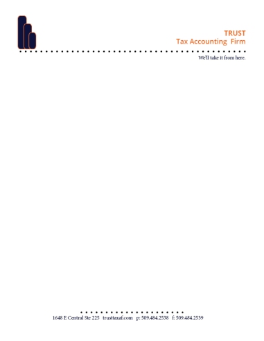
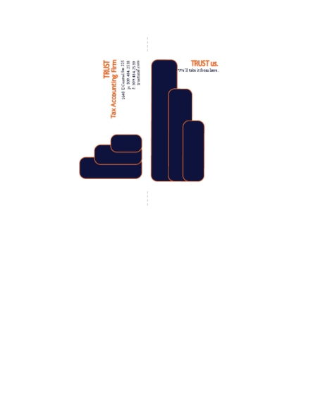
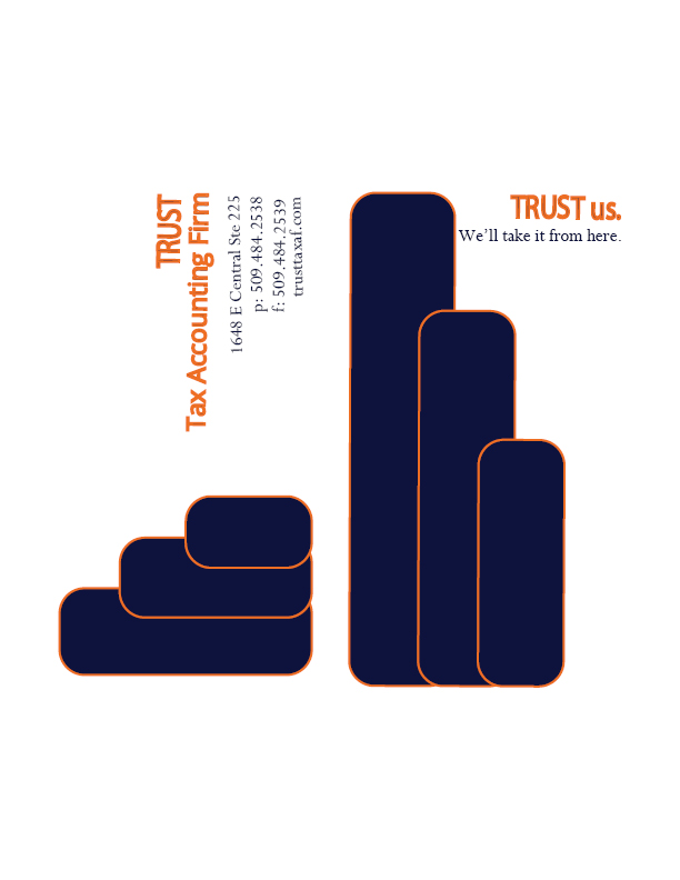
Color scheme and color names: For the portfolio, I used complimentary shades of blue and orange.
Title Font Name & Category: AR BERKLEY from the Script category.
Copy Font Name & Category: Calistro from the Oldstyle family.
Thumbnails of Images used:

Sources (Links to images on original websites / with title of site):
Pixbay Backgrounds:
https://pixabay.com/en/photos/vintage%20backgrounds/


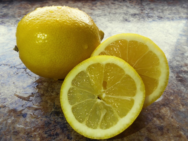
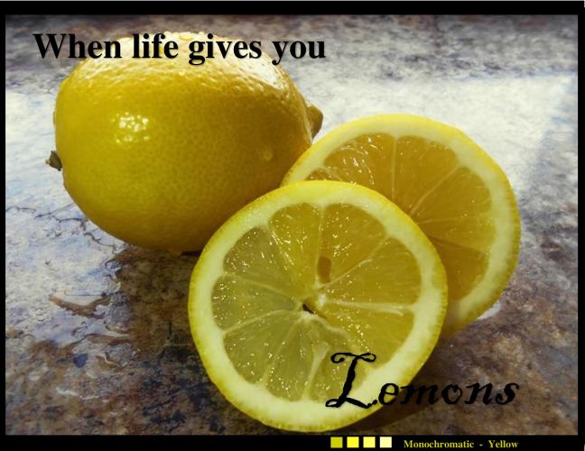 Description: I absolutely love spring. Spokane has never had steady weather, and I am just ready for some sun! Anything with lemons helps bring a little spring to me, so I snapped a picture of some lemons. I took the picture right by a window to get as much natural light as I could. I also had to use some extra lighting in order to get a brighter picture.